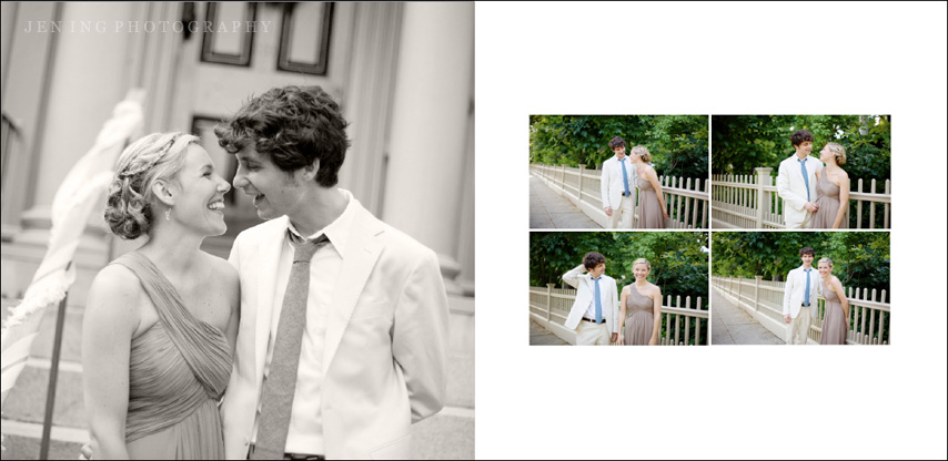
I’m beginning to offer albums now as part of my packages and have recently chosen a company that does wonderfully simple leather, flush-mount albums. While I don’t currently have any images of what the books look like just yet, I’m excited to order sample albums to show clients and have begun to design some layouts in the process. These aren’t necessarily what the final layouts will look like, but I want to share screenshots of a couple of the spreads as I’m starting to work on them. They’re really fun to design! Working on the layouts is bringing back memories from my high school Yearbook Committee days, where we spent hours and hours designing layouts by hand using graph paper, rulers, and wax pencils. Thank goodness for Adobe InDesign, these days! :)
I prefer clean, simple layouts so that the focus is on the images themselves. Each image below (from Amber and Will’s wedding) is a 2-page spread for a 10×10 album.


mu gusta muchisimo!